Best Practices for Responsive Web Design: Discuss the importance of responsive web design and provide tips and techniques for creating websites that adapt seamlessly to different devices and screen sizes.
-
soletstalkapp
- Posted on
- 0 comments
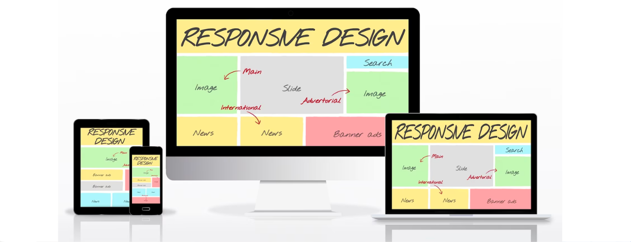
Responsive web design is a critical approach to web development that ensures websites adapt and provide optimal user experiences across various devices and screen sizes. With the increasing use of mobile devices, it is essential to prioritize responsive design to reach and engage your audience effectively. Here are some best practices for responsive web design:
1. Mobile-first approach: Start designing and developing your website with a mobile-first mindset. This means creating a design that works well on smaller screens and then progressively enhancing it for larger screens. By prioritizing mobile, you ensure a smooth and user-friendly experience for mobile users, who form a significant portion of your audience.
2. Flexible grid and layout: Use a flexible grid system, such as CSS Grid or Bootstrap, that allows content to flow and adapt to different screen sizes. Design your layout with relative units, like percentages or ems, rather than fixed pixels. This allows elements to resize proportionally based on the user’s screen size.
3. Media queries: Implement media queries to apply specific styles based on different screen sizes. Media queries allow you to customize the layout, typography, and other design elements to optimize the user experience across different devices. Use breakpoints to target common device sizes and adjust the design accordingly.
4. Fluid images and media: Ensure that images and media elements, such as videos or embedded content, scale and resize smoothly. Use CSS properties like max-width: 100% to prevent images from overflowing their containers. Consider using responsive images techniques, such as the srcset attribute or the picture element, to serve appropriately sized images based on the user’s device.
5. Readable typography: Choose fonts, font sizes, and line heights that are legible on both small and large screens. Avoid using small font sizes that may become unreadable on mobile devices. Use a responsive typography approach, where the font size adjusts based on the screen size, to maintain readability across devices.
6. Touch-friendly navigation: Design navigation menus and interactive elements with touchscreens in mind. Ensure there is enough spacing between links or buttons to prevent accidental clicks. Use larger touch targets to accommodate finger taps. Consider implementing off-canvas menus or hamburger menus for mobile devices to save screen space.
7. Performance optimization: Responsive design should not sacrifice performance. Optimize your website’s performance by minimizing file sizes, reducing HTTP requests, and leveraging browser caching. Compress and optimize images, minify CSS and JavaScript files, and utilize content delivery networks (CDNs) to deliver your website assets efficiently.
8. User testing and iteration: Test your responsive design across multiple devices and screen sizes to ensure consistency and usability. Conduct user testing to gather feedback and identify any issues or areas for improvement. Iterate on your design based on user feedback to enhance the user experience and address any usability concerns.
9. Accessibility considerations: Ensure your responsive design is accessible to users with disabilities. Use semantic HTML markup, provide alternative text for images, and maintain proper color contrast for text and background elements. Test your website with assistive technologies and follow accessibility guidelines, such as the Web Content Accessibility Guidelines (WCAG), to make your site inclusive to all users.
10. Ongoing maintenance and updates: Responsive design requires ongoing maintenance to adapt to new devices, screen sizes, and technologies. Stay up to date with industry trends and best practices. Regularly monitor and optimize your responsive design to ensure it continues to provide an optimal user experience as new devices and technologies emerge.
By following these best practices, you can create responsive websites that deliver seamless experiences across various devices and screen sizes. Prioritizing responsive web design helps you reach a wider audience, improve user engagement, and enhance your website’s overall performance.